Accessible multi-level dropdown navigation
There are several ways to make complex navigation responsive. You might have heard terms like Off-canvas menu, Skip to footer menu or Multi-level dropdown menu. In every navigation patterns there are pros and cons. Probably the best navigation is without any sub menus and Hamburger icons on smaller screens. We’d just show the navigation links as they are on mobile screens also.
Theme Hybrid site is a good example of how you can always access navigation items.

Nagivation on larger screens

Navgiation on narrow screens
But what if we have more complex navigation and our customer wants responsive multi-level dropdown menu. In this article we’re going to take a closer look how to make multi-level dropdown menu more accessible in the same time. If you want to jump right into the end results, here they are:
- Github repo.
- Live demo.
- Original issue for more details.
Goals for our accessible responsive multi-level dropdown menu
We talked about how to create better, more accessible WordPress themes before. And I wrote about the ideas what I’d like to see in accessible navigations patterns. In this example we’re going to take a closer look at dropdown menus. We use Responsive Nav by Viljami Salminen as our base navigation. It has several advantages build in already:
- It’s lightweight.
- Doesn’t require any external Javascript library like jQuery.
- Works without Javascript too.
- Removes the 300 ms delay between a physical tap and the click event.
- Have been tested and works in all major desktop and mobile browsers, even IE 6.
- Have CSS3 transition build in.
Responsive Nav already has multi-level branch but I wanted to create my own fork out of the master branch for better accessibility. My goals for accessible responsive multi-level dropdown menu looks like this:
- Better support for keyboard users.
- Better support for screen reader users.
- Using buttons instead of links for toggling.
- Try to remove 300 ms delay on dropdown buttons also.
- Demonstrate that we don’t always need hamburger icon.
- Use more ARIA markup.
- Still works without Javascript.
- Still doesn’t require any external Javascript libraries.
I also wanted to build it with WordPress and other CMS platforms in mind. They normally use predefined classes in menu items and sub menus. That’s why I added new options for changing them. You can check examples from readme file.
Let’s get started, shall we.
Better support for keyboard users on larger screens
On larger screens we’re used to access sub menu items using mouse hover effect. We want to same effect for keyboard users who navigates links using the Tab, Shift + Tab and Enter keys. In many cases you can’t access to sub menu items using keyboard. Let’s fix that in the same way as we talked before when creating more accessible themes.
Once again we use Underscores toggleFocus() from navigation.js file.
- When a menu link is focused or blurred, set or remove the
.focusclass on the menu link. This is done with thetoggleFocus()function. - Add class
.focusin your stylesheet, where you have:hoverstyles for the menu. - You can now navigate your menu and sub menus using the
tabandShift + tabkey.
In the end I’d also like to have arrow key support for navigation.
Keyboard users on smaller screens
When menu is collapsed we still need to access sub menu items using keyboard. This is the basic idea:
- We add dropdown toggle buttons using Javascript. This way we don’t have to worry about them in our markup and dropdown menu would still work even if Javascript is disabled.
- We add the same events to dropdown buttons as in menu toggle button.
- We can open the sub menu using Enter key and tab trough to sub menu items.
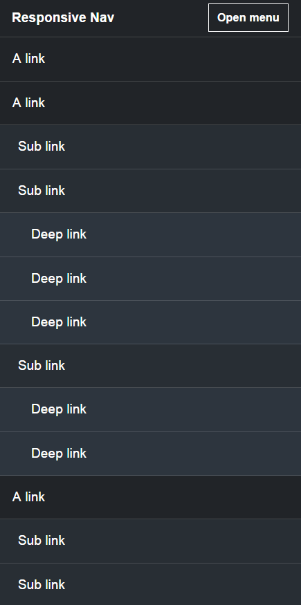
- Mobile menu when javascript is disabled
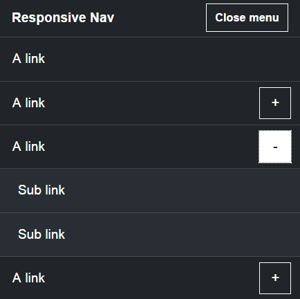
- Mobile menu when javascript is enabled
Note that sub menu toggle is not just basic click event but we use the same events as in Responsive nav menu toggle. For me the biggest change is that toggle works even on “clumsy” clicks. Basically you can hold the button for a while and when our finger leaves the button, menu or sub menu opens. Now even my Mom can open the menu and sub menus. Hi Mom!
Then I run into another issue.
Focus on sub menu items
@samikeijonen am a screen reader user & without me activating the menu, why my focus moves to a sub menu during tab?
— Raghavendra Satish P (@artofvision) August 19, 2015
Check for Twenty Fifteen demo where you can access the sub menu items using keyboard Tab and Enter only if you open the sub menu first. In my case you could access sub menu items without opening the sub menu first.
Like @artofvision mentioned probably Twenty Fifteen logic for sub menus is what most people expect. But how do we achieve that? Only method I could think of is using display: none for sub menus. And when toggling sub menu open, we overwrite that using display: block.
Is there any better way for handling focus on sub menus? Is this the most accessible solution? I don’t know, that’s why I’m asking 🙂
All I know that it gives some troubles for CSS animations for drop downs I had in mind. One solution could be use visibility CSS rule.
Edit: For navigation I went with visibility CSS rule and it works great. But for sub menus I need to figure out how to calculate height of the sub menu. Otherwise max-height and visibility CSS rules don’t play nicely together what it comes for smooth animation.
Touch devices
We haven’t even discussed about touch devices yet. Have you tried accessing sub menu items using iPad when menu is in “Desktop” mode? That is something that have been driving me crazy for years and I still don’t know the ultimate solution. I do use Javascript to enable “hover” touch support but it doesn’t seem to work in every browser that I’ve been testing. For example in iPad using Chrome I run in to issues.
Let us know if you have a solution for touch device dropdown issue. In some cases it even works with pure CSS but does it work in most common device and browser combinations and is it accessible for keyboard users also?
I have personally used solution found in Underscore theme, branch called fixMenuTouchTaps.
ARIA markup
There are several ARIA markup added in the navigation that’ll help screen reader users to get better understanding of our menu system.
aria-expanded="true"oraria-expanded="false"are added dynamically to buttons that toggles the menu or submenus. Same ARIA attribute is also added to navigation itself. These attributes are removed from menu toggle button on “Desktop” screen. This is done inside resize function.aria-haspopup="true"is added to menu items with submenus.aria-controls="nav-id-name"can be added via settings.
Using multi-level dropdown navigation in WordPress theme
Readme file have basic examples how to use multi-level dropdown menu and the end result can look like in the demo.
We can do the same in WordPress Theme. In functions.php file we use wp_enqueue_scripts hook to enqueue our javascript files. Here is the example gist file.
Note that we’re using wp_localize_script function to pass localized parameters to our functions.js file. And this is how functions.js file can look like.
We can also have more that one menu and some of them could have enableDropdown set to false.
Overview of the new settings
There are several new settings compared to original Responsive Nav.
enableFocus: false, // Boolean: Do we add ‘focus’ class in nav elementsenableDropdown: false, // Boolean: Do we use multi level dropdownmenuItems: "menu-items", // String: Class that is added only to top ul elementsubMenu: "sub-menu", // String: Class that is added to sub menu ul elementsopenDropdown: "Open sub menu", // String: Label for opening sub menucloseDropdown: "Close sub menu", // String: Label for closing sub menuresizeMobile: function(){}, // Function: Resize callback for “mobile”resizeDesktop: function(){}, // Function: Resize callback for “desktop”
By default multi-level dropdown is set to false because of the backwards compatibility. Play around with the settings and see what fits to your project.
Using dropdown setting in the Customizer
We could even add setting in the Customizer where site owner can disable or enable multi-level dropdown menu.
This is useful if you have only one sub menu in your navigation with few menu sub menu items. In this case you can add new parameter to wp_localize_script function.
'dropdown' => get_theme_mod( 'disable_dropdown' ) ? false : true
Here is full code example for that. And in functions.js file you could have this setting.
enableDropdown: navSettings.dropdown
Here is full code example for enabling dropdown setting via Customizer.
Conclusion
Building accessible multi-level dropdown navigation is not easy, at least not for me. While there are lot’s of solutions out there already I hope this example gives you ideas what we should look for and how to use it in WordPress theme. I have used this method in couple of client sites and in Toivo theme.
For me this project was also very important learning process. I basically suck at Javascript and I needed to get my hands dirty to learn more.
You can find the code and demo in the following links if you want to test it out.
Feel free to use it in your projects also but note that this is not official branch for Responsive Nav and I might have to change something when I play around it more.
Like I said in the beginning the best navigation is probably without multi-level dropdown sub menus. Then again I think my next project could be accessible off-canvas menu. Let me know if you have ideas or questions about any accessible menu patterns.